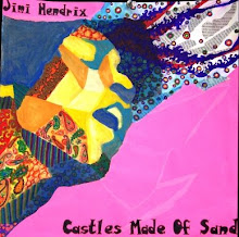
This week I decided to use the first of my three "free-bees" (aka pieces I did at the end of junior year). I chose "Excited" because it was the least developed of the three and I thought I could add the most changes to it. The face reflects the emotion of excited through the raised eyebrows, face partly off the page, and newspaper springing from his head. The design structure is a repetition/gradation structure with bright colors and busy lines to heighten the excited feeling. After the critique, I developed the face more (added more value), sharpened/cleaned up the structure, and extended the newspaper out further to balance the work. In order to match my previous concentration pieces, I tried to integrate the portrait and the structure by adding a hand poking out and the illusion of torn paper, to make it seem like the figure is breaking out of the structure. I do feel like this is less strong than my others....
Friday, October 30, 2009
Tuesday, October 20, 2009
Concentration #5: Terrified
I decided to branch out a little bit for this piece. After our first 4 pieces we had a cumulative critique of sorts, and I was told to experiment with including more of the body of my portraits and integrating the portrait with the design structure more. I thought about this while creating this concentration. The overriding theme of this piece is the style reminiscent of a comic book. I researched Roy Liechtenstein to get an idea of how to draw comic-book-style--sharp edges, high contrast, no subtleties in value, text (which I made a parody of by saying things like "Design!" and "Unity!" and "Contrast!"), and simplistic figures. The girl on the right is a full-body "portrait," showing the emotion of "terrified" through expression and body language. The explosions and whatnot form the "design" portion...yet the whole work is unified through the style. After the critique, I tried to keep the contrast yet minimize white space by coloring the background in very light gray and blue watercolor. I also cleaned up edges and added flames and things to balance the work. I feel like this is the concentration piece that shows the most risk-taking so far.
Saturday, October 3, 2009
Concentration #4: "Smug"
In this concentration I focused largely on design to bring across the emotion of "smug." First of all, I tried a new approach by dividing the piece into 4 squares. I incorporated a gradation structure with black-and-white triangles in two of them. With this structure I also thought about manipulating space in two ways: 1) using gradation to make it seem like the structure is receding into space, and 2) creating different-sized triangles to give the illusion of curved lines. In the other two squares I did two different portraits of the subject (good job Brett) in different "smug" positions, with high (and scary-looking) contrast. The structures are supposed to reflect "smug" by the high "lofty" effect of them receding into space. After the critique I corrected issues in both faces (value, making the expression look more smug) and incorporated lines extending out from the structure to make it mesh with the rest of the work. I feel like the faces still need some work to make the whole effect more "loose" (with brushstrokes, etc.) to emphasize the carefree, indifferent aspect of being smug.
Subscribe to:
Posts (Atom)