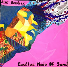
This week I decided to use the first of my three "free-bees" (aka pieces I did at the end of junior year). I chose "Excited" because it was the least developed of the three and I thought I could add the most changes to it. The face reflects the emotion of excited through the raised eyebrows, face partly off the page, and newspaper springing from his head. The design structure is a repetition/gradation structure with bright colors and busy lines to heighten the excited feeling. After the critique, I developed the face more (added more value), sharpened/cleaned up the structure, and extended the newspaper out further to balance the work. In order to match my previous concentration pieces, I tried to integrate the portrait and the structure by adding a hand poking out and the illusion of torn paper, to make it seem like the figure is breaking out of the structure. I do feel like this is less strong than my others....

Don't be so hard on yourself! I really like this piece and it definitely shows excitement. I love what you've done with the torn strips of newspaper coming out of the top of his head; however, I feel like the pieces to the left of his head are for some reason a bit distracting. The bright design structure and the man's facial expression create a really nice effect. It reminds me of the Dixie Classic Fair and how busy, exciting, and bright it is, haha.
ReplyDeleteI also really like the way you brought the newspaper down into his face and continued to add value. It looks as if the newspaper is slowly melting into the values of his face! This is really cool Daniel, can't wait to see your future pieces (especially the Mary one haha).
Her kind of looks like a creeper. But the expression is priceless! the stream of newspaper shooting out of his could have made some kind of pattern.The colors match really well with the piece and adds that mood fitting to the piece
ReplyDeleteDaniel! this piece took alot of time, preparation, and thought and i think the additions and changes you made to it were very effective. The only thing i would suggest is that you focus a little less on the newspaper and maybe add some more stucture into it somehow, just to incorporate it with the background a little more. I know you want equal balance between the subject (portrait) and the stucture and design with your piece and i think where you are going with this piece is really showing that. Just keep pushing it further, its an amazing piece.
ReplyDeleteThe changes you made to this piece have really strengthened this work. The design structure and the background and the color scheme you chose for it really portray the idea of excitement. Also, the composition of the face and and hand are very engaging and make it seem as if the man is about to jump out of the page. I especially like the newspaper spinning out of his head. It gives he illusion that he is very excited and his energy is spilling out of him. Good work on reworking this piece.
ReplyDeleteGreat job! I think one suggestions woudl be to draw back into the neewspaper and continue to develop mark-making. Overall, however, it is a successful integration of design and drawing.
ReplyDelete