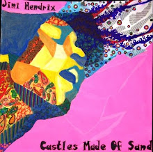
Here is my last concentration--I can't believe it's done, woohoo! Anyways, I wanted to inject a little more humor into my concentration (the only other one with some kind of humor is #5, Terrified) by portraying the "lovesick" emotion (good job capturing that, Dustin). This time I wanted to make the whole composition just the portrait, yet incorporate design into the portrait in the form of abstracting the values into concrete shapes. To bring across the emotion, I used a red/pink color scheme, citrasolved images of roses in the face, citrasolved images of Valentine hearts in the background, and hand-wrote (with the help of others) fake, passioned love letters which went in the face and the background. I feel like this concentration is successful because there is a good level of layering/complexity, high contrast, and obvious execution of the emotion. Although it may be a step back conceptually from my story-like previous pieces, I feel like overall it's one of my better ones. Merry Christmas!

takeing a risk and using PINK nice work. the color and the contrast potray the emotion well.
ReplyDeleteI really like the layering of this piece. the candy in the background, the writing, and the different layers of color on the face are all very interesting and risk taking. I think his expression and the content of this piece shows his emotion very well.
ReplyDeletewow, this piece is really impressive daniel. the complexity and layering really makes this piece interesting. the mixture of the love notes and the candy hearts makes the emotion that you are attempting to convey very clear. plus, i love the way that you gave the figure an almost rose like appearance. The colors, shadows, and folds make it look like the person is made up of roses! very cool, good job :)
ReplyDeleteword. i love it. He actually really looks and shows emotion! i like how you wove words into the face to show shading or texture.
ReplyDeleteDaniel,
ReplyDeleteThat looks great! Good job, I really like your last piece a lot. You did a really good job showing his emotion and I also really like the values of his face. I also like the cheesy :) background (with the candy hearts). You are so much better today then you were couple months ago, keep up the good work!
Beautifully created! I love the concept and execution of the design! My one criticism would be to work back into it to solidify shape and clean up lines in the marker areas.
ReplyDelete