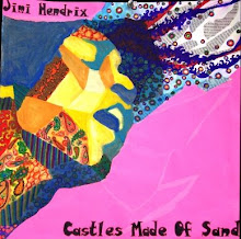
I felt like I needed a nice figure drawing for the portfolio, so I took a drawing I had done at Spoleto Study Abroad a couple of years ago and worked back into it..mostly defining the space around the figure and such. I tried to keep the original marks of the figure to keep the sense of motion in it. I like the position of the figure and the emotion that suggests, but this piece is weaker than some of my others.
Monday, April 26, 2010
Thursday, April 22, 2010
Breadth #10
My first goal for this piece was to use a different surface and shape--so I bought a circular piece of wood at Lowe's. I wanted to do another good portrait, and since I've recently fallen in love with the art of John Singer Sargent, I studied the way that his portraits combined realism with loose, expressive brush strokes and drastic value ranges. I also wanted to do a sort of modern take on classical/Renaissance/ancient Roman styles--I thought the circular format, toga-looking shirt, and idealistic (as far as beauty) expression and position would reference that as well. I did this of my sister Elena and worked quickly in order to capture the expressiveness of the figure, doing many layers, using different color schemes and focusing mainly on shape. I am really pleased with the result!
Breadth #9
So..I can safely say that I worked for this one. Kristen, Hanna and I went out to Mrs. Helton's vineyard over our conference days and did some landscape oil painting. I felt that my breadth section needed a good landscape piece, and I decided to reference Impressionism as my style. I looked at Monet, Van Gogh, Hassam, and Sargent for inspiration. After an underpainting I slowly built up my big, medium, and small shapes, then finished with impressionistic mark-making. My focus is, of course, studying light--reflected off the top of the great old barn, the drastic shadows on the blue picnic table, and the ground speckled with shadows of trees. I loved working with oil paint and I felt that this is probably the best oil painting I've done. :D
Tuesday, April 13, 2010
Breadth #2
Sorry for the out-of-order posts...we hung an interesting still-life from the ceiling and the premise for this piece was to incorporate more than one perspective of the still life (we had to switch seats as we were working). I had a hard time at first finding out how to construct a successful composition and effectively abstract such a realistic subject..but I think the composition is successful. The part of this that may need work is just the development-I don't want to lose the loose quality, but the piece may need more contrast.
Breadth #1
This piece is actually the first breadth piece I did-the general premise was to do a self-portrait loosely based on the style of one of our concentration pieces (to ease us into breadth). I chose to do mine in the style of my Concentration #10 (expressive lines, charcoal). I also incorporated design, like my concentration pieces. For this piece I tried to capture the looseness and motion of a figure drawing-I tried to make an interesting expression and have the design structure kind of morph into the subject. I feel like this is one of the most successful portraits I've done. :D
Monday, April 5, 2010
Breadth #8
For this week, I decided to do another realistic work to balance out my abstract pieces. I was in orchestra one day, leaning on my cello and dozing, when I suddenly saw an awesome composition! So I took a picture of my cello from an interesting angle/viewpoint, showing a lot of reflection. The work is on canvas with black-and-white acrylic paint. I feel like I reached new levels of detail with this piece...I've always gotten to a level in painting where I'm too lazy/unwilling to really delve in and add intricate detail--but this time I made myself go to that level, and I think it paid off. I like the exploration of reflections/distortions in this piece, and I also like that you can see my hands, one of which is holding a bow (I think it adds content to the piece).
Breadth #7
I felt that my Breadth section needed a strictly abstract composition, so I decided to experiment with watercolors on clayboard this week. I researched mainly Frankenthaler for inspiration and began by pouring watercolored-water on the surface and seeing what shapes formed from it. Then I defined and layered on top of the shapes, using watercolor crayons. I also subtracted by using scratchboard tools in some areas. The main things I focused on during this project were color and color schemes, composition, and texture (through water stains, scratch-marks, etc.). As an imaginary landscape, I think of a mountain range or something when I see this. I like this one because it adds variety to my portfolio and I took a risk in doing it.
Breadth #6
This project is...somewhat unique...? I had some trouble developing my ideas with this one. I researched pen-and-ink political cartoons of Hogarth and surrealism; I wanted this piece to have more content than my previous ones. The piece is supposed to illustrate the tension between traditionalism and modernism. I cut up a book called The Philosophy of Morality and collaged it throughout the piece, underlining particularly stuffy or limited statements to show the absence of freedom in traditional things. The top of the work is simply detailed and realistic, showing an interior space with two pillars (the "pillars of knowledge"?), while the bottom begins to "break out" with swirls and bright, surrealistic faces and feet. This is supposed to show how modernism breaks free of all restrictions. I feel like the content of this piece is definitely stronger than my others, yet the composition is somewhat weak. I'm ambivalent.
Breadth #5
The candid advice that Mrs. Danahy gave me for this project was: to LOSE IT (i.e. don't worry about intricacy or development and just be loose and creative). And so I researched loose, expressive, and abstract artists such as de Kooning and Matisse; I chose a large piece of cardboard for my surface (my largest work yet) and started collaging with torn paper. I worked from a picture of my grandmother holding my mother as a baby in her austere 1950s living room. After my layer of collage, I came back with acrylic paint and tried to loosely and expressively define the figure of the woman and baby. After the critique I concentrated on emphasizing certain areas to bring the subject forward and the bright/intense colors in the background back. I'm very happy with this piece because I feel it shows the greatest contrast to my other pieces--and I actually had fun doing it!
Breadth #4
Our assignment for this Breadth was to render some interior space in our house. I chose my pantry and the Italian items in it (De Cecco pasta boxes, olive oil, red wine vinegar, etc.). I started with a brown underpainting and then worked up layers, going from loose to ultra-detailed. I even used markers to add some of the intricate lettering to cans and such. I feel that this one is ok as an exercise in still life and realism, yet nothing sets it apart or takes it to that next level of success in art...
Breadth #3
Our assignment for this week's Breadth was to take pictures of the snow, CitraSolv an image onto watercolor paper, and then work back on top of it with chalk pastel. I chose a more abstract/design-oriented image of trees and their shadows on the snow, and then took it a step further by repeating it 4 times. Then, I worked back with pastels in an impressionistic style. I feel that this one is ok, considering that we did 3 projects in one week and this was one of them.
Subscribe to:
Posts (Atom)