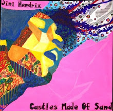
In response to suggestions about technique, I defined the background to create contrast and make it look more like water. I also heightened the contrast of the face and tried to make the expression look more peaceful. I feel like this work is better than simply a portrait because of the design I have employed through the repetition of organic shapes that create the image of water. I tried to make the shapes have variety in shape and color yet unity and harmony. I think that the integration of the water design structure and the portrait demonstrates the emotion of peace well. For risk-taking, I used unreal colors and values in the face and hair, to unify it with the aqua background. I also made the hair blend into the background structure. Finally, this work definitely reflects my usual style and interests--oil paint, portraits, and expressive mark-making.

This piece is successful because it not only develops your concentration statement well but also incorporates design and drawing. This piece is risk-taking because it combines a complex design structure in the background with a portrait in the foreground. The values and colors are well executed and the composition accurately portrays the emotion of peace. The only thing I would work on is the contrast of so much brightness and while on the right edge of the painting between the darker shades on the left edge. The change is a bit dramatic and pulls attention away from the face. Otherwise this is a great start to your concentration.
ReplyDeleteI really like your first piece it is very good it shows your abilities very well and i think that my biggest idea would be to define the water into more like a ripple than a wave but it will look good no matter what you do.
ReplyDeleteGreat job! Amazing first piece. You are very talented and need to keep doing art for forever! I love how the hair blends into the water and she looks so serene. So awesome job and we can't wait to see what is coming next!
ReplyDeleteDaniel - Nice job. I think the integration of design schemes into portraits to push the concept of "expression" is a strong one. I agree with your statement earlier this week that when there is a true focus on the design structure the art is more dynamic. So, my suggestion for concentration #3 is to perhaps emphasize the structure over the portrait and let the structure determine the emotion. You're doing great - keep up the strong work.
ReplyDelete