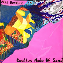
Here is my last concentration--I can't believe it's done, woohoo! Anyways, I wanted to inject a little more humor into my concentration (the only other one with some kind of humor is #5, Terrified) by portraying the "lovesick" emotion (good job capturing that, Dustin). This time I wanted to make the whole composition just the portrait, yet incorporate design into the portrait in the form of abstracting the values into concrete shapes. To bring across the emotion, I used a red/pink color scheme, citrasolved images of roses in the face, citrasolved images of Valentine hearts in the background, and hand-wrote (with the help of others) fake, passioned love letters which went in the face and the background. I feel like this concentration is successful because there is a good level of layering/complexity, high contrast, and obvious execution of the emotion. Although it may be a step back conceptually from my story-like previous pieces, I feel like overall it's one of my better ones. Merry Christmas!
Thursday, December 24, 2009
Monday, December 7, 2009
Concentration #11: "Jealous"
Ok, so first of all, I know this picture has some glare on it; I'll replace it with a better picture when the oil paint dries. This is my attempt at another solely oil paint piece-I didn't want "Peaceful" to be the only oil painting. I feel like this piece is one of the better ones thematically, but one of the weaker ones technically. My idea to convey the emotion of jealousy was to stretch reality by transforming the portrait into a gargoyle, looking on from the top of a church where a faceless couple are getting married. The fact that the person is a statue emphasizes the harshness and all-consuming nature of jealousy. The design in this is the repetition of the garden hedges onto the side of the building and into the background: almost as if the emotion of jealousy is closing in on everything, a festering emotion. I had a lot of trouble with this one--I did a lot of problem-solving and had to re-acquaint myself with the basics of oil painting...I feel like, technically, I still have a ways to go. I am happy with the values in the statue, yet I could not get the style to become lose, abstract, and focused on shape (like Emily Branch's stuff). After the critique (and Mrs. Danahy's help), I re-drew and re-sized the gargoyle, defined shapes, and lightened up the background to make the values make more sense. Overall, I am not satisfied with this, and plan to try and revisit it somehow.
Wednesday, November 25, 2009
Concentration #10: "Pensive"
This piece is, sadly, the last of my "freebies." I feel like I transformed this one the most from what it was before compared to the two other freebies. This emotion is "pensive," or thoughtful/confused/ruminating. The jagged design structure is supposed to represent the portrait's jumbled thoughts, with the glued-on scrabble board pieces the actual jumbled-up thoughts and words. Changes I made to the piece before and after the critique include altering the expression of the face slightly (lowering the eyebrows and adding values around the temple) to make the expression more "pensive" and less "vacant." :) I also cleaned up some of the scribbles I had made with charcoal previously and added more newspaper in some areas. As for the design structure, which used to be an irrelevant "D to S" gradation from another project I had done, I colored everything black to make it less busy, and added another concentration structure of scrabble pieces on top of it. I feel like this piece is strong because it has many layers and high contrast.
Monday, November 16, 2009
Concentration #9: "Elated"
I found it a bit hard to follow my last concentration...it was hard coming up with this one, because I wanted it to be conceptually equal to my last one. So I settled on showing somebody who is imagining winning a soccer game/scoring a goal, and all the glory with it: the portrait (great job Philip) has a very happy expression and the body language of his arms raised helps heighten the emotion. The design structure is an overriding radial/concentric structure which is also the soccer net. The portrait is interacting with the structure because he is "caught" in the net. After the critique, I added more contrast to the portrait, added different watercolor colors in the background, and included faint watercolor paintings of an imagined crowd on the right-hand side. I'm pretty happy with this one, but I think I want to turn away from really detailed, methodical stuff and try oil painting again!
Concentration #8: "Disgusted"
I feel like this one may be my most "advanced" work yet, conceptually and technically. I thought of how I could use an intermediary subject to help bring forth an emotion. Since my emotion this week was "disgusted", I settled on drawing a fly close-up with all its weird, gross appendages. I changed my usual medium this time by using watercolor crayons/watercolor for the first time. The fly's eyes are the design structure (repetition/gradation), and the portrait is reflected in one of the fly's eyes (AND MY SUBJECT WAS MARY NOVAK! haha), so you really get the feeling of someone being disgusted because they are looking at a gross fly. After the critique, I added color to the eyes to help it blend into the piece better, brought some circles more into the other eye to integrate them, and cleaned up the background to define the rest of the fly's body, etc. I personally am really proud of this one...:)
Concentration #7: "Angry"
Ok...so I'm finally getting up my next three (!) concentrations. This one is called "Angry," and is another work I added onto from last year (another freebie, you could say). To bring across the emotion of Angry, I used bright, warm, intense colors; an overriding concentric radial/gradation structure, and a subject of a very beside-himself old man. At the critique, I thought about how I could improve this piece and have it suit my new ideas for my concentration. In order to incorporate the portrait into the structure, I drew lines from his head into the wheel-like structure, to make it seem as if he is being pulled into the structure. I also blurred the lines of his face and made parts of the structure actually cut into his face. My whole idea for this is that anger is an unbalanced and "enveloping" emotion that's hard to control, thus the man being drawn into this endless cycle of anger. In addition, I added contrast/value to some parts and cleaned some things up. I think this one turned out well.
Friday, October 30, 2009
Concentration #6: "Excited"
This week I decided to use the first of my three "free-bees" (aka pieces I did at the end of junior year). I chose "Excited" because it was the least developed of the three and I thought I could add the most changes to it. The face reflects the emotion of excited through the raised eyebrows, face partly off the page, and newspaper springing from his head. The design structure is a repetition/gradation structure with bright colors and busy lines to heighten the excited feeling. After the critique, I developed the face more (added more value), sharpened/cleaned up the structure, and extended the newspaper out further to balance the work. In order to match my previous concentration pieces, I tried to integrate the portrait and the structure by adding a hand poking out and the illusion of torn paper, to make it seem like the figure is breaking out of the structure. I do feel like this is less strong than my others....
Tuesday, October 20, 2009
Concentration #5: Terrified
I decided to branch out a little bit for this piece. After our first 4 pieces we had a cumulative critique of sorts, and I was told to experiment with including more of the body of my portraits and integrating the portrait with the design structure more. I thought about this while creating this concentration. The overriding theme of this piece is the style reminiscent of a comic book. I researched Roy Liechtenstein to get an idea of how to draw comic-book-style--sharp edges, high contrast, no subtleties in value, text (which I made a parody of by saying things like "Design!" and "Unity!" and "Contrast!"), and simplistic figures. The girl on the right is a full-body "portrait," showing the emotion of "terrified" through expression and body language. The explosions and whatnot form the "design" portion...yet the whole work is unified through the style. After the critique, I tried to keep the contrast yet minimize white space by coloring the background in very light gray and blue watercolor. I also cleaned up edges and added flames and things to balance the work. I feel like this is the concentration piece that shows the most risk-taking so far.
Saturday, October 3, 2009
Concentration #4: "Smug"
In this concentration I focused largely on design to bring across the emotion of "smug." First of all, I tried a new approach by dividing the piece into 4 squares. I incorporated a gradation structure with black-and-white triangles in two of them. With this structure I also thought about manipulating space in two ways: 1) using gradation to make it seem like the structure is receding into space, and 2) creating different-sized triangles to give the illusion of curved lines. In the other two squares I did two different portraits of the subject (good job Brett) in different "smug" positions, with high (and scary-looking) contrast. The structures are supposed to reflect "smug" by the high "lofty" effect of them receding into space. After the critique I corrected issues in both faces (value, making the expression look more smug) and incorporated lines extending out from the structure to make it mesh with the rest of the work. I feel like the faces still need some work to make the whole effect more "loose" (with brushstrokes, etc.) to emphasize the carefree, indifferent aspect of being smug.
Saturday, September 26, 2009
Concentration #3: "Bemused"
For my 3rd concentration piece, I chose the emotion of "bemused." To help bring across this particular emotion, I chose a subject who I thought had a dynamic face for the emotion (yeah Georgia :), used bright, warm colors for the circles, dynamic mark-making with high contrast, and incorporated an overriding gradation/concentration structure of circles and popping "bubbles." I hoped that this would emphasize the feeling of bewilderment and "being non-plussed." After the critique, I took the technical advice and shortened the chin of the subject to help increase the sense that the perspective was angled from the top down. I also tried to integrate the newspaper with the bubbles portion by extending the design over the newspaper and filling some of the circles with newspaper. I also increased the contrast of the subject and drew in with cool colors to make the subject pop forward.
Friday, September 18, 2009
Concentration #2: "Grieving"
This piece focuses on the emotion of grieving. To help bring this emotion across, I made the style harsh and grating, the contrast high, and the design structure be reminiscent of tears. I also worked on the body language and expression of the portrait to heighten the sense of desperation. I made a lot of changes to this piece as I went along and based on the critique. I took out distracting elements like table "legs" on each side and a random puddle on the bottom, tried to define the water droplets better, add the texture of wood to the table, and make the values of the face more drastic and finished. I think I still need to do something about the white on the top background; it looks distracting. I also am not quite satisfied with the face's expression.
Thursday, September 10, 2009
Artist's Response, Concentration #1
In response to suggestions about technique, I defined the background to create contrast and make it look more like water. I also heightened the contrast of the face and tried to make the expression look more peaceful. I feel like this work is better than simply a portrait because of the design I have employed through the repetition of organic shapes that create the image of water. I tried to make the shapes have variety in shape and color yet unity and harmony. I think that the integration of the water design structure and the portrait demonstrates the emotion of peace well. For risk-taking, I used unreal colors and values in the face and hair, to unify it with the aqua background. I also made the hair blend into the background structure. Finally, this work definitely reflects my usual style and interests--oil paint, portraits, and expressive mark-making.
Wednesday, September 2, 2009
Concentration Statement, AP 2D Drawing Portfolio
For my concentration, I plan to explore how human emotions (exemplified in varying portraits) can be intensified and reflected by the type of media used, the style of the piece, and the type of design structure in the background. First, I will use different types of media to help enhance different emotions; for example, I may use watercolor to reflect sadness, wistfullness, or depression; oil painting to show anger or anxiety, etc. Next, I will think about the style in which I create works of art. For example, if I wanted to convey a peaceful or relaxed amotion, I would use broad and loose brush strokes; if I wanted to show intensity I would concentrate the strokes and heighten contrast. Finally, I plan to consider the design structure of the background. I want to have some kind of integration of mark-making/drawing and design in each work, because I've come to realize that a combination of the two really increase the quality overall. That will be the type of risk-taking I hope to do. I also want to explore what kind of design structures convey a certain mood, atmosphere, or reaction-- and how they shed light on the subject. Lastly, I want to explore how I can push the idea of a "design structure" further than a simple pattern, trying to use the principles of that design in a more tangible background.
Tuesday, May 26, 2009
Monday, May 25, 2009
Concentration Statement
For my end-of-year concentration project, I went into it thinking I would simply explore how I could incorporate design structures and portraits together in an interesting way. Each piece would consist of a repetition/radiation/concentration/gradation structure, a pencil/acrylic portrait, and newspaper/mark-making to integrate the two. I used my worst project as my first concentration, because what came out of it interested me and I wanted to explore it further. As I continued with my 2nd and 3rd concentrations, however, I came to realize that I was doing the exact same thing I had done last year---exploring different emotions. The first concentration features a cool-color design and rather sad facial expression, the second had bright, warm colors and an angry expression, and the third had busy colors and an alert expression. So I guess what I am exploring is how design can both be integrated into a portrait and how it can describe the emotional expression of the portrait.
Friday, May 15, 2009
Wednesday, May 13, 2009
Silkscreen Project
After about 8 weeks of working on this project, I'm pretty satisfied how it came out. Our requirements were to create a silkscreened image of a portrait of some sort--not necessarily a human portrait. In addition, the work had to exemplify pop art in the style of Andy Warhol by reflecting desensitivity through repetition and consumerism/popular culture.
To make this work reflect Andy Warhol, I thought about three things: the way Warhol used bright, unreal colors over realistic prints, the way he repeated portraits of famous people, and (in the border) the way he haphazardly arranged prints (like in his Mona Lisa piece).
I chose to make a conventional idea of a portrait my subject: a head shot of John Lennon repeated 9 times in a simple repetition structure. However, I hoped to expand on this to bring my points across: I alternately colored and wrote text to show the two aspects of John Lennon's personality. The images with bold, almost jarring colors and the haphazard arrangement around the border represent the image Lennon projected to the world: a facade of toughness and edginess. Then, the images with text show the inner, sensitive side of him through his most profound song lyrics, the only means by which he could pour his whole soul into. I almost kept the original image as it was, but decided to add a border of a haphazard arrangement of John Lennons on colored backgrounds, almost like a symbolic border of outrageousness that he put around himself. Finally, I added further song lyrics to the top and bottom borders to try and unify the work more.
This work falls under the conventional definition of a portrait. It reflects consumerism and influence of the media because John Lennon was a very marketed figure and received much publicity for being the leader of the Beatles, his dramatic antics, and dramatic murder.
Subscribe to:
Posts (Atom)